Go Away Cruises (Rebrand)
rebranding, branding, brand Identity
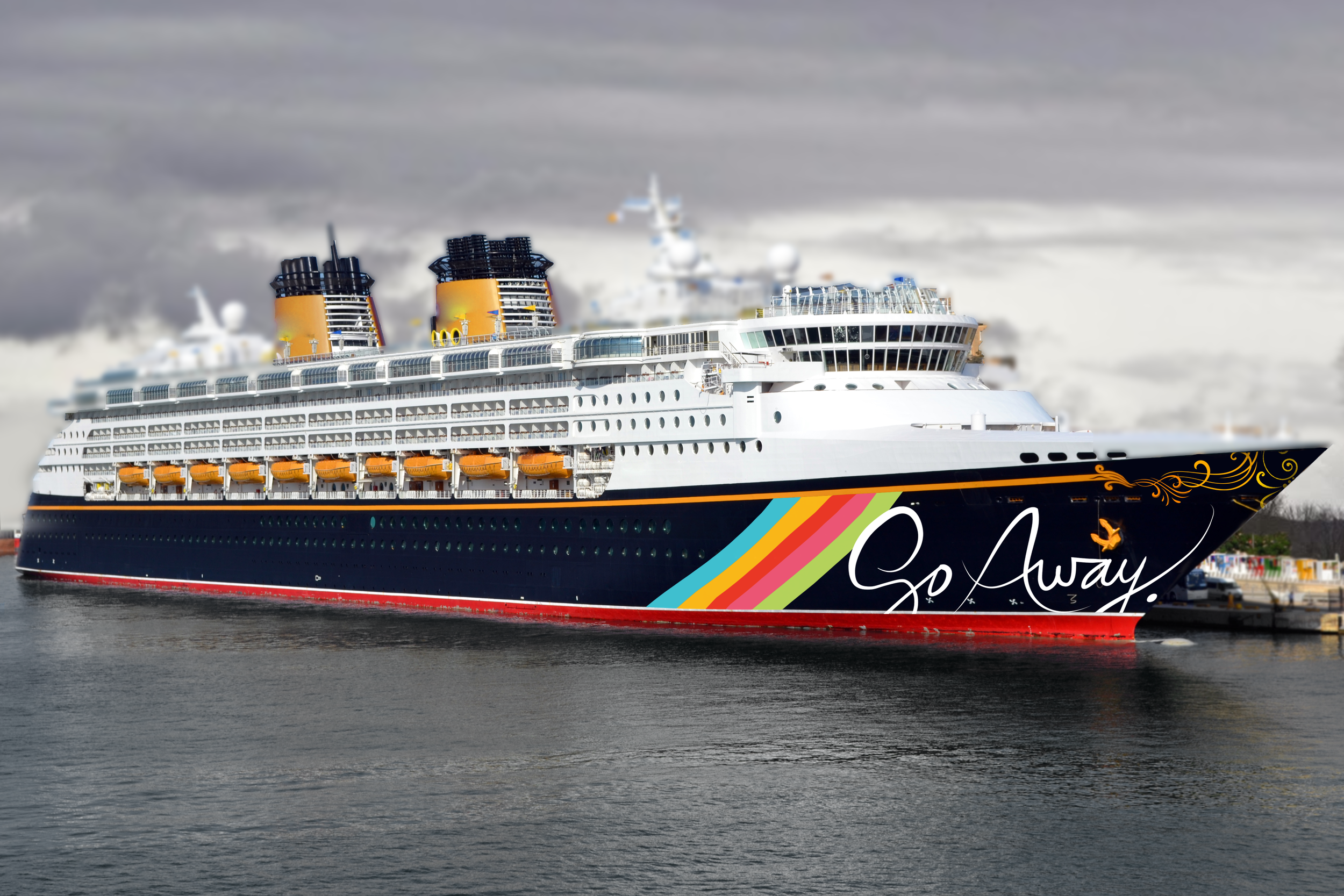
Formerly known as Princess Cruises, I was assigned to rebrand a failing covid-19-ruined cruise line. With the current pandemic and the future of leisure at stake, I took an edgy, anti-cruise approach to create the isolated. satirical cruise of my dreams. Say bon voyage to the world and Go Away to a cruise where you can let your introvert dreams run wild.
As a designer and introvert, I empathize and wish to go away sometimes as well. I wanted to combine my passion for vivid colors and solitude that would appeal to younger audiences (ages 26-45) who maybe spent the last year or so in their parent's’ house.
Brand Attributes: edgy, solitary, abrasive, exclusive, modern, bold
Let’s take a tour!Before and After
Ship Exterior and Interior
Showing cruises in a way that has never been seen before: empty…by choice.
Each guest can enjoy their beautiful, large, private bathroom with an ocean view.
You’ll Steal These
Writing with a strong and bold voice and understanding a brand’s personality is key. I made sure to use my humor and wit to create an “attitude” for these unique products that make the target market laugh and feel understood.
We know that you will steal all the toiletries you can when you go to a hotel - that’s why we made sure to make every product as beautiful, hilarious, and clever as you are. ;)
Print and Product Design
Our target audience are people who have learned to hate cruises, believing that they are only for newlyweds and nearly deads…I wanted to show unconventional designs that are edgy yet vibrant, to entice the consumer to want to learn more.
Experience the pleasure of our cruise anywhere! All of our products emphasize Go Away and either hide or omit the word ‘cruises’ to create mystery and make sure we’re marketing to the right people. ;)
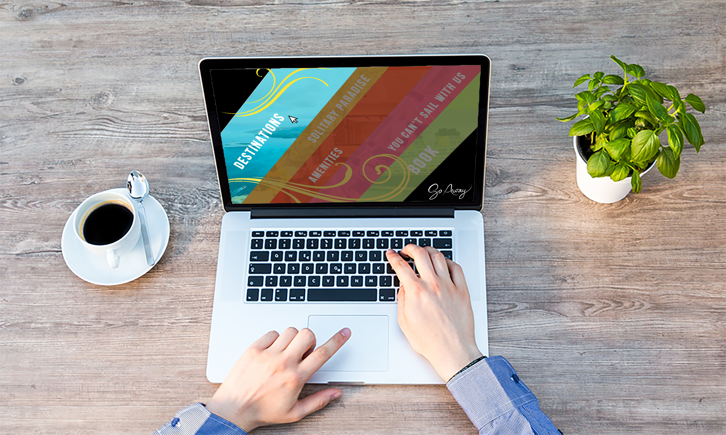
Web Design
Websites are overrated, let’s make it fun! The unique diagonal approach sets us apart from our competition, and the dynamic interaction with the navigation makes sure the customer will enjoy their time on the website. Our destinations are only within California, because with climate change and pollution on the rise, we want to focus on the experience of quietness instead.
Stationery
When you hand someone a business card, they’re usually going to throw it away. We wanted to prevent that and provide the dual functionality of making it easier to tell someone to f*** off. ☺
Not Your Typical Cruise
Let’s face it, we are what people call “weirdos”…the quirky, unique, artsy, edgy individuals who want to enjoy cruises and the beautiful ocean, but can’t stand society as a whole. We get it, you have an image to keep, so let’s keep it real. Take your perfect Instagram shot with no B.S. fake smiles.
This could be you!
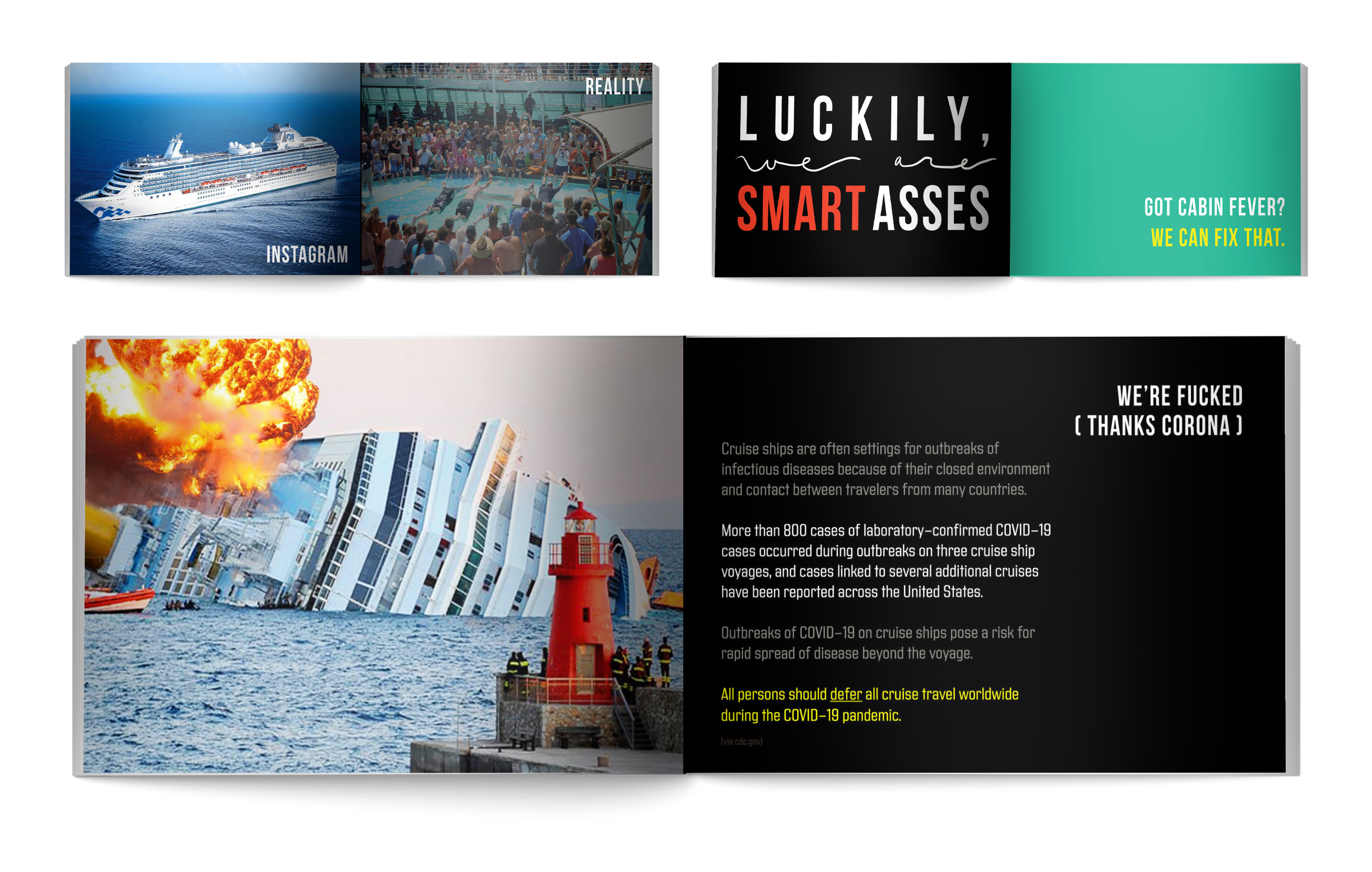
Brand Bible Spreads
Below is a collection of my favorite spreads! I enjoyed the cheeky copywriting and incorporated real world data and quirky typography to drive the brand’s voice home!
Please Advise…
Mental health and social justice are incredibly important to me, and with having brands that are honest and abrasive, it’s important to draw the line on what is okay and not okay.
Brand Details (Type, Color Palette, Photo Style)
It was incredibly fun designing rules with my brand’s voice. As designers often work in teams, I found it incredibly valuable to learn how to specify rules and to communicate it clearly and beautifully. The more details the better! Speaking of, here’s a link to the PDF of the complete brand bible!
Process
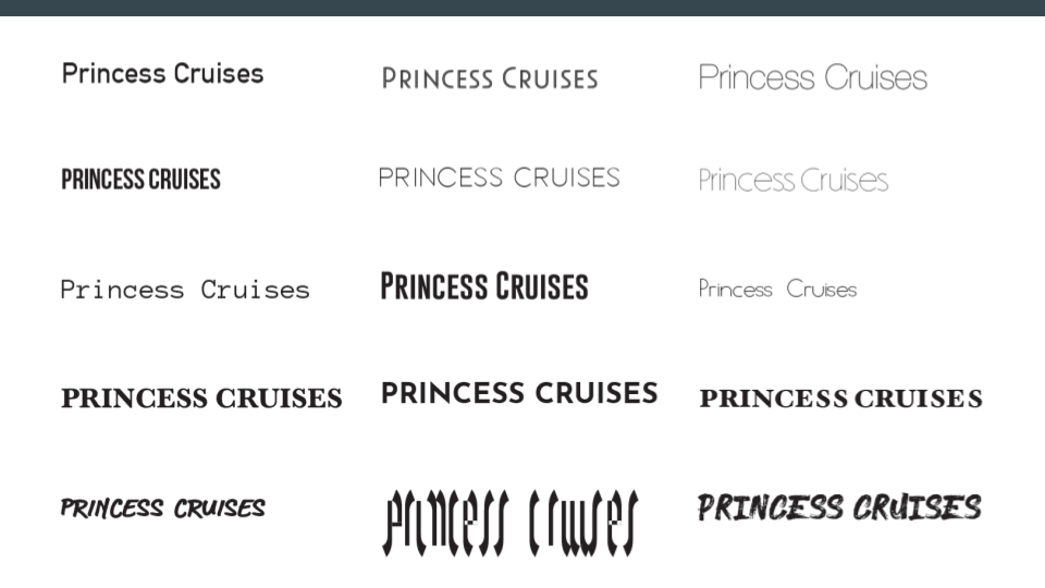
Great ideas need time, refinement, and collaboration. Below is a culmination of my word marks, sketches, and mood boards that helped me create my final masterpiece.
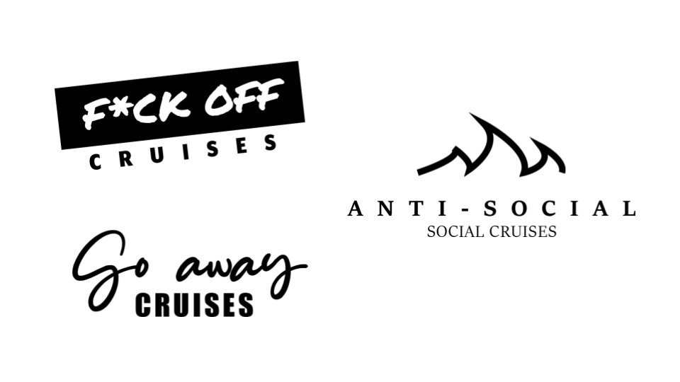
I tried several styles that were handwritten cursive to evoke a ‘fancy’ feeling, and enjoyed creating a variety to choose from! I ditched Princess Cruises because I wanted to try something new, and after being inspired by my mood boards of something more cheeky, I fully embraced that. I ultimately chose the final word mark because of the fancy air and the mockery of fancy holier-than-thou cruises. I also chose it because of the whimsical vibes and the ‘A’ resembles that of a wave, sail, or even a fin. I also made the decision to eliminate the word ‘cruises’ to have an air of mystery and humor with the words ‘go away’ being in the forefront. :)
Conclusion
Ultimately, this project has taught me how to push myself out of my comfort zone and to create exciting, non-traditional branding that is unique. I find that from approaching a problem from a completely unexpected angle, I expose double the possibilities and I learn much more. Go Away Cruises helped elevate my branding skills and innovative thinking. I am very grateful for the direction I had creating this…now go away (and email me!).
. . .

